StreetSpots
An app connecting skaters with resources to fuel their passion.
overview
The skateboarding industry is growing year over year. It went from a niché movement to becoming an Olympic Sport - think about that! The bread and butter of skaters are the spots they go to shred, and the friends with whom they share their experiences. StreetSpots is an app concept that seeks to provide an outlet where skaters can connect to these resources & more in order to fuel their passion and grow their skills.
Problem
The few available apps dedicated to skaters are riddled with issues. They have inconsistent and buggy designs (i.e., they don't load properly, and have fake locations). They offer little incentive for their users, and therefore there is little buy-in.
solution
I sought to provide a product with a familiar, minimal and consistent design. StreetSpots includes tutorials from professional skaters, deals on merch, a social platform to share/discover amongst peers, as well as a functional map feature for location scouting.
Read full case study
Where
Minneapolis, MN
What
Native Mobile
Role
Designer, Researcher
Category
E-Commerce, Sports Industry
When
June - July 2023
Process
Personas
user flows
Wireframes
style guide
High-Fidelity UI
Prototype
Reflection
summary
competitive analysis
So, why a new skate app?
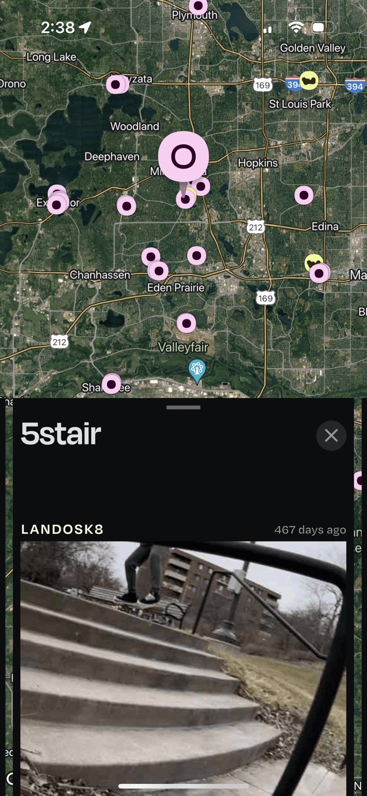
There are a few skate spot apps out there, but these three have the most users/buy-in. However, in the grand scheme, there isn’t a very large user base. None of the apps seem to be growing at a rate reflective of the industry’s growth
ShredSpots
Loke
Smap
The Good
All apps allow for adding of new spots with some customization
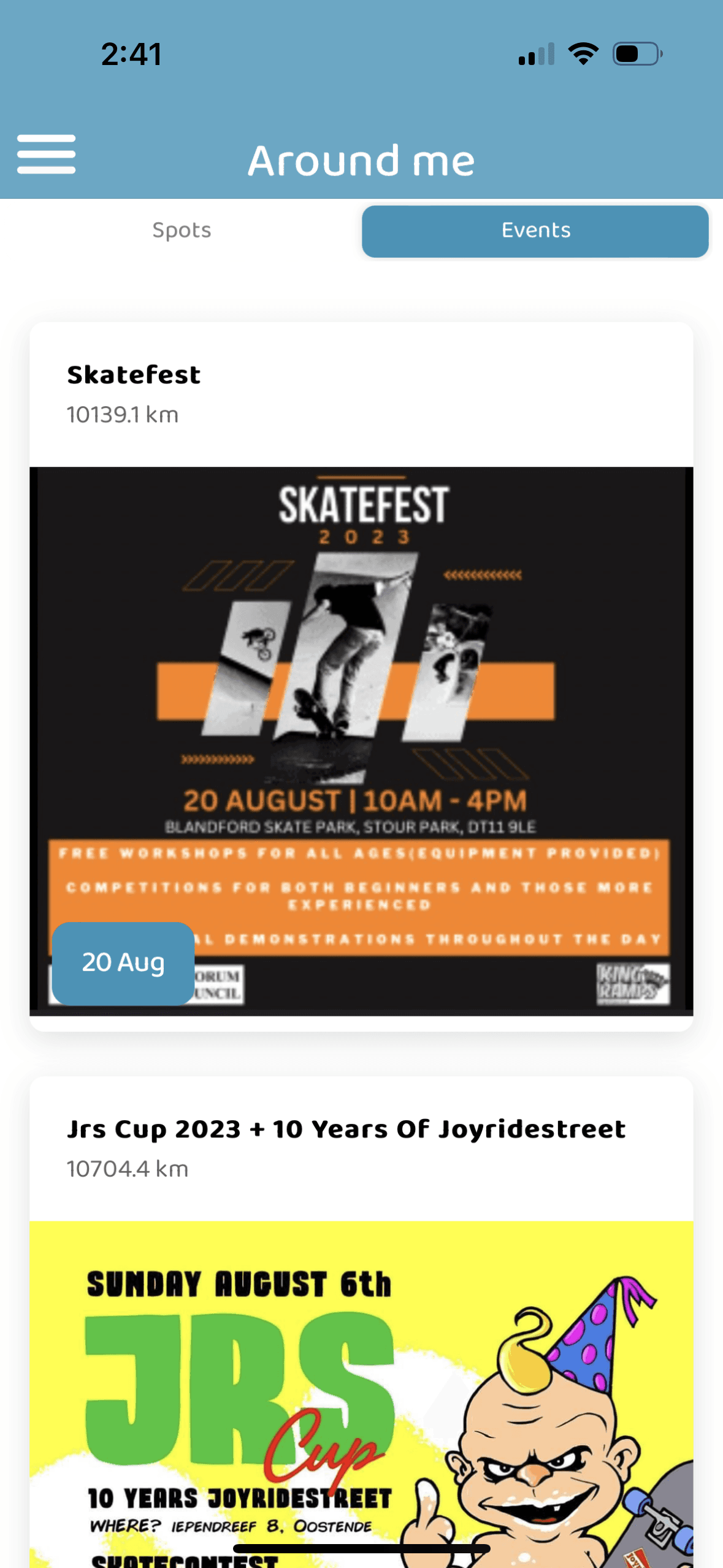
Two offer event postings
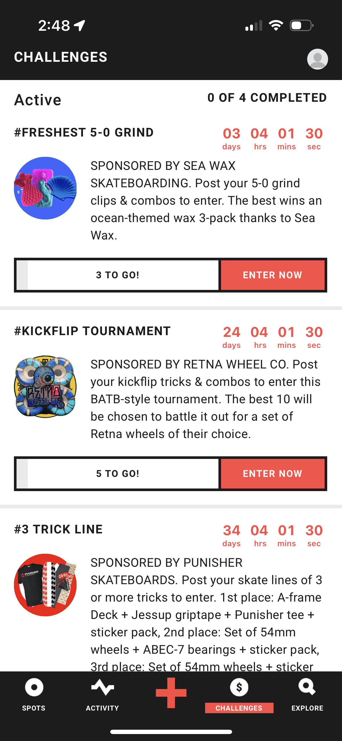
One (LOKE) offers “challenges” as a source of community engagement.
The Bad
Outdated & buggy UI that can be confusing to navigate.
None offer tutorials.
User engagement is sporadic.
Current offerings
Consistently buggy - most notably, GPS crashing
Offer limited functionality - ex. searching via/inputting an address when adding new spot
Minimal incentive to use app regularly - could solve with more brand investment/tutorials/events
Therefore, my aim was to focus on solving for these three issues when designing StreetSpots
personas
The casual and the diehard, alike.
I created two unique personas to demonstrate the diverse potential for Street Spots.
There's room for both.
Edgar
He is at a more foundational level, looking to improve on his fundamentals and find more spots with friends.
Therefore, he could use an app that provides him a way to find spots and connect with skaters, while also learning more about his craft.
Jimmy
He's at a point where his talent is high enough to obtain a sponsorship.
Therefore, he could use an outlet where he can get noticed by some brands who may be able to sponsor him.
Now, to meet their needs.
Once I went through all of my research data, here's how I determined to solve for the problems at hand:
Utilize Google Maps to offer better functionality in GPS
Provide a feature that allowed for users to input address when searching for spots & when adding new spots.
Partner with major brands and skaters by adding shop tab and tutorials features
From there, it was time to sketch out the first flows and initial low-fidelity wireframes.
user flows
Make it flow.
To outline all the necessary functionality I created a simple flow diagram of the main tasks the user can do. Fail state flows were also created, but are not shown due to space constraints.
Main user flow

Wireframes
Apply the process.
Once the flow diagram was established I began with a set of low-fidelity wireframes, then moved on to applying the thought process to mid-fidelity.
A couple of notable incorporations:
I love the horizontal icon list that Airbnb uses for quick filtering on their mobile platform.
I sought to incorporate this, yet with skate-specific icons
I also sought to create a layout with simple styling of cards for ease of scanning, emphasizing the image and a few important details.
Style guide
Simple & consistent design.
High Fidelity Mockups
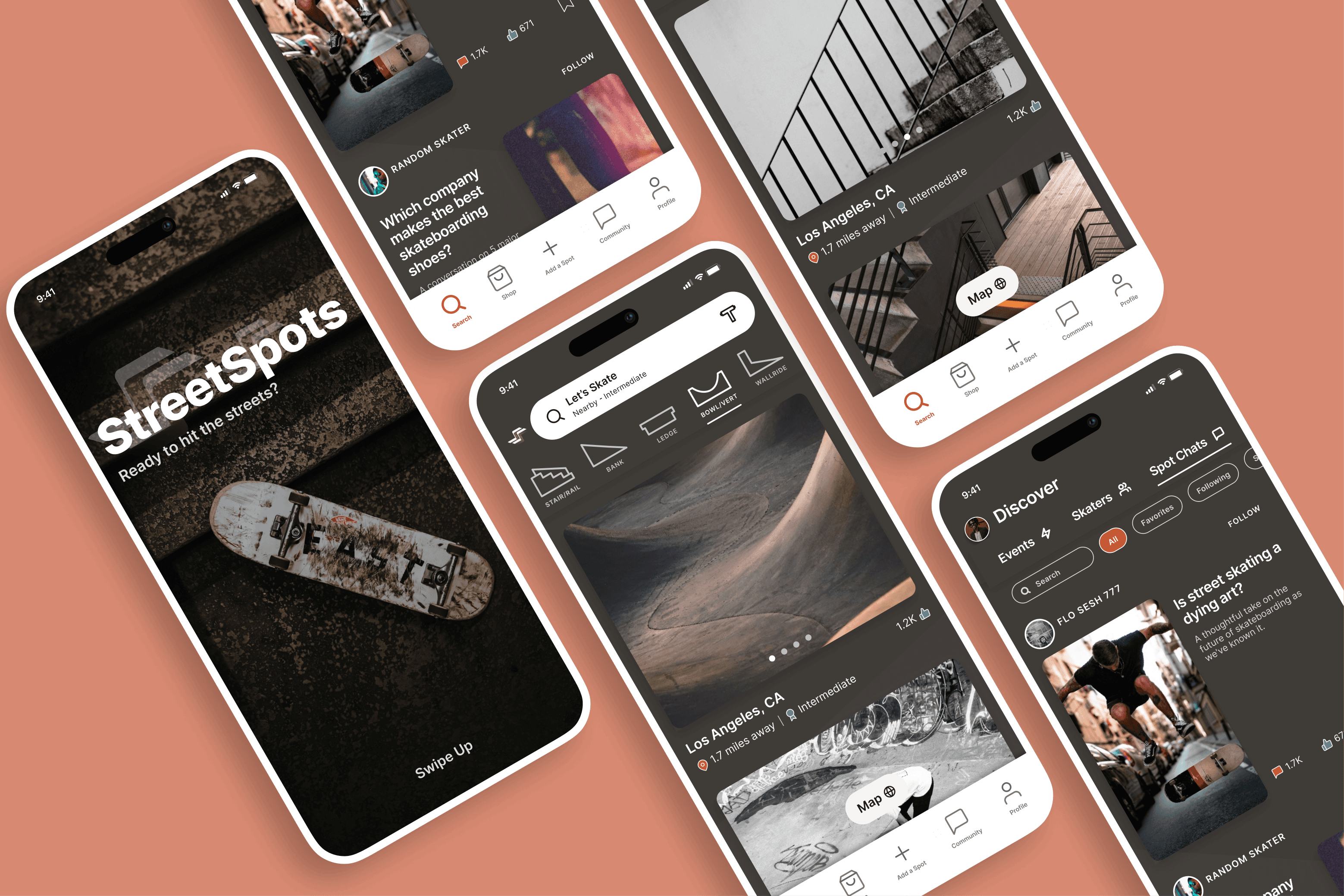
The skate community is friendly, inherently resilient and contagious in its energy. Therefore, I sought to give the app a feel that resonates with these very things.
With the initial flows considered, I began working on some of the main app screens - firstly, choosing a color palette and font.
Color Palette
I chose an off-brown as the background, bringing its secure, resilient feel, often due to its association with the earth.
For accents I went with shades of orange/yellow/green which are often associated with warm energy, optimism, friendliness and harmony.
Not only would they evoke these sorts of emotions, but they would also pop with the dark background - giving emphasis to important CTAs.
Minimalist look & feel
This style was achieved by simple icons, a "workhorse" text and small accents throughout.
My text of choice was Inter as it is simple and non-distracting, with a modern look and feel.
Adhering to an 8-pt grid ensured my users would not be distracted by any inconsistent and uncommon spacing issues. Instead, they would be able to focus on the task at hand - SKATING!
Alignment and Grid
8 point grid
4, 8, 12 & 24 point margins (within groups)
8, 12, 16, 24, & 32 point margins (between groups)
Accent, primary, secondary, tertiary, background
Font & Icons
Inter - Regular, Medium, Semi-Bold, Bold, CAP
AaBbCcDdEeFfGgHh

High-FIdelity UI
A familiar form to fit just right.
Taking some tips from those who've gone before - I found inspiration for the hi-fi designs in popular apps like Instagram, AirBnb, and Flo.
Having a solid idea up front, I maintained the general layout and flow of the designs from wireframes to hifis. One minimal change included the elongated thumbnails on the profile page as I sought to differentiate the visual feel from other social platforms.
In all, I designed 39 Hi-Fi designs including a number of the main screens in a light mode.

So, how is this helping?
Jimmy and Edgar had issues that the other apps were not suitably solving for. Therefore, the designs & user flows shown thus far demonstrate features added to try and help our friends:
More brand/professional partnerships in the way of a shop tab
Events featured, and tutorials provide an outlet for both of our friends
For Jimmy to be noticed and potentially gain sponsorship
For Edgar to learn through tutorials given by pro skaters
Google Maps is integrated for reliability & fewer crashes as well as the ability to search for spots & add new ones via a specific address
help our friend Edgar find reliable spots in new places.
Some other notable features, which I believe would be more useful due to a greater incentive to use the app, are those pertaining to connecting with other skaters and sharing videos/pictures/chatting.
Prototype
Bring it all together.
I connected the high fidelity designs into a clickable prototype. This would allow for initial user testing.

Accessibility evaluation
Make it accessible.
The app has been evaluated for contrast to match the AA standards of WCAG. In some cases I found that the contrast can be improved.
One specific example is the NavBar “Active” status. The original orange color just barely failed AA small text standards. So, although it was a minimal, it was necessary to change this. With the new NavBar orange, it has passed both standards.


reflection
General
I loved skateboarding as a kid and I still love it today. Of course, I'm not hurling myself down staircases anymore, but I certainly still dream of it. With this passion in mind, I designed this app. I enjoyed ideating on what might support skaters in their endeavors to enjoy their craft and become the best they can be at it.
challenges
Some unique challenges:
Creating custom icons is something that I had not yet endeavored to do on my own. This was a solid challenge for me and inspired me to learn more about it in the future.
How can I make this a product that is simple to use and effective at providing solutions?
Gleaning insights from the designs of familiar and popular products, I was able to put forth some ideas
As the sole designer/researcher, I have a lot of creative liberty but this comes at a cost. A team of designers brings a wealth of insights from differing perspectives and vantage points..
lessons
Teams of one are great, and they have their place. However, it always pays off to ask for perspective.
Designing a visually beautiful app is one thing. Validating it through testing and research is where the proof is revealed. I would love to pursue this and develop StreetSpots further in the future.
Summary
Wrap it up.
deliverables
I performed a market evaluation
Created a set of low fidelity wireframes, connecting them into a prototype
Built them out to high fidelity, beautiful UI designs
In the last checkup round, I also performed a QA audit focusing on consistency and color contrast with regards to accessibility
next steps
This first iteration focused on adding features that would help to solve for our users' problems. If unconstrained by time & resources:
The next step would be to perform user testing in order to evaluate whether our designs helped to solve for the problems adequately.
From then on, I would create new iterations based on research findings.

