Eden Care Medical - Employer Group portal
A B2B portal empowering HR reps to manage their employees' health benefits.
overview
Eden Care Medical seeks to provide health insurance and the tools necessary for managing employees' plans. The Employer Group Portal is meant to give HR Admins everything they need to quickly and easily manage their employees' plans, settings, and their organization's health plan metrics.
Problem
A small set of High-Fidelity designs was shared with our team to be prototyped, tested for usability, and improved.
Before testing, the product had several apparent issues regarding consistency of spacing, accessibility, usage of font styles, and its information architecture. Through testing, our suspicions were reinforced by user's feedback/inability to accomplish certain simple tasks easily. These findings gave further reason to reconsider and iterate upon the designs.
solution
As team lead, I helped promote clarity and collaboration for the improvement of the Employer Portal. Our solutions involved:
rearranging key elements of its information architecture and designing new components, optimizing for more intuitive user flows and ease of use.
Spacing issues were fixed by adhering to an 8-pt grid, font styles were reassessed for consistency throughout,
A number of the color styles/button states were changed to pass WCAG accessibility guidelines.
Read full case study
What
Web Application
Why
Further Product Development
When
Oct - Dec 2023
Role
Team Lead, UX/UI Designer & Researcher on a team of 5
Category
Health Care
Process
scope
Prototype
User Testing
Hifi Designs
summary
REflection
next steps
scope
Set the stage
Eden Care Medical is a digital health insurer targeting employers in Africa, starting in Rwanda. They also offer a stand-alone wellness and prevention product to complement our health insurance product.
Relevant information for designing which we were given by the client:
The majority of employees are 28-40 years old
60% are men, based in the capital city, middle-income
Work in the service industry and are digitally savvy
The most important note given by the client regarded their end users as being "digitally savvy." This helped shape our framework and perspective moving forward as we sought out individuals for user testing.
deliverables
My roles included serving as team lead and participating in the design/research.
As team lead, I was in charge of:
corresponding with the client and our supervisors
communicating deadlines with team members
facilitating overall project management under the guidance of my superior.
As designer/researcher:
I worked on the changes to the settings flow with one other designer in the early stages
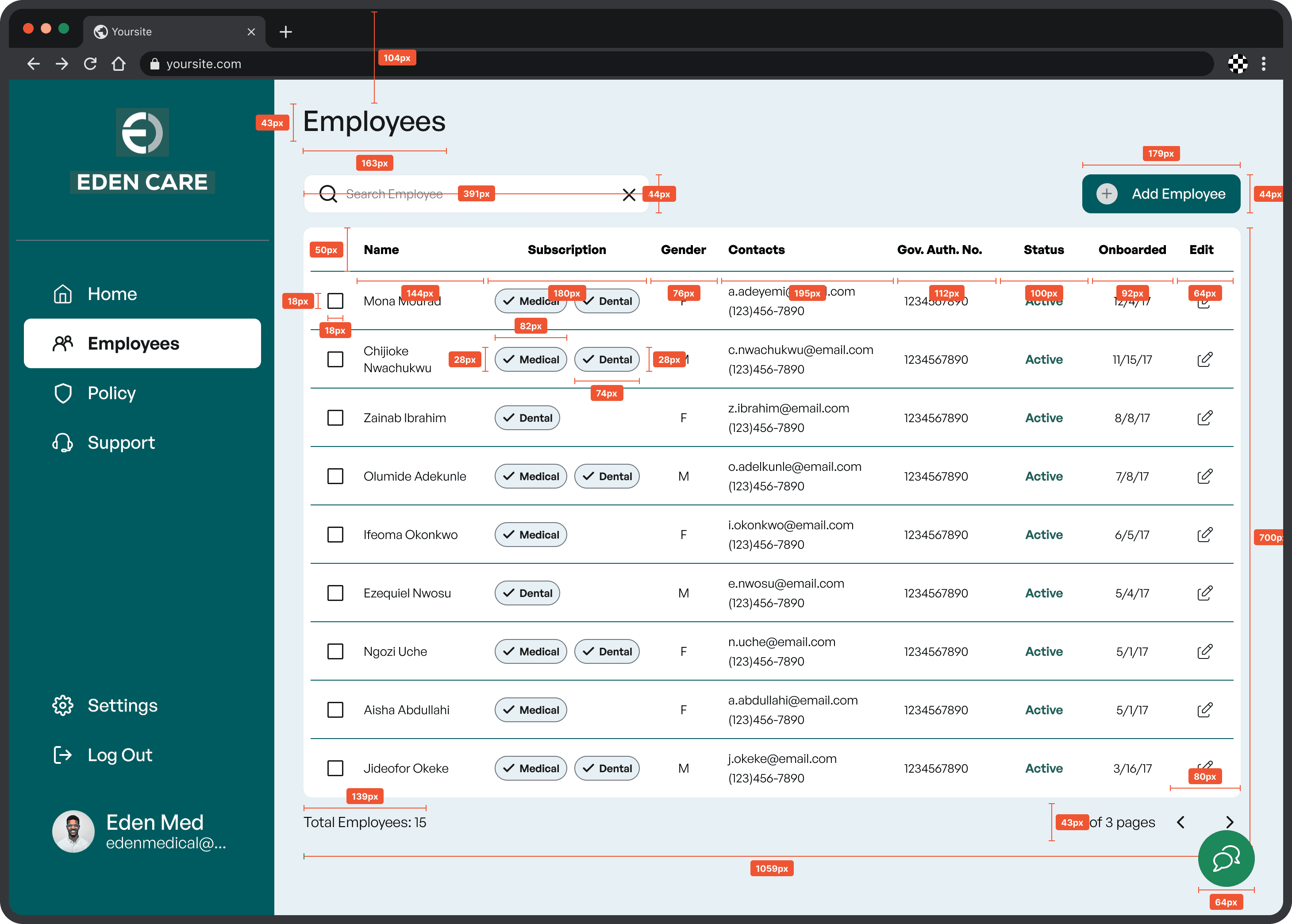
I took on the redesigning of the employee info table
Throughout the project I collaborated with all of the teammates, respectively, offering inputs on overall design/style guide/etc.
Determine the purpose
Our objective in prototyping & testing was to discern any issues with the given flows regarding usability, accessibility, or design. Based on the results, we would then recommend and implement improvements.
Prototype
Assemble the pieces
As we were working with existing designs, the first phase did not involve iterations upon the UI, but rather connecting them into a prototype.
The prototype focused on four basic flows:
1. Create an account and view the dashboard upon logging in.
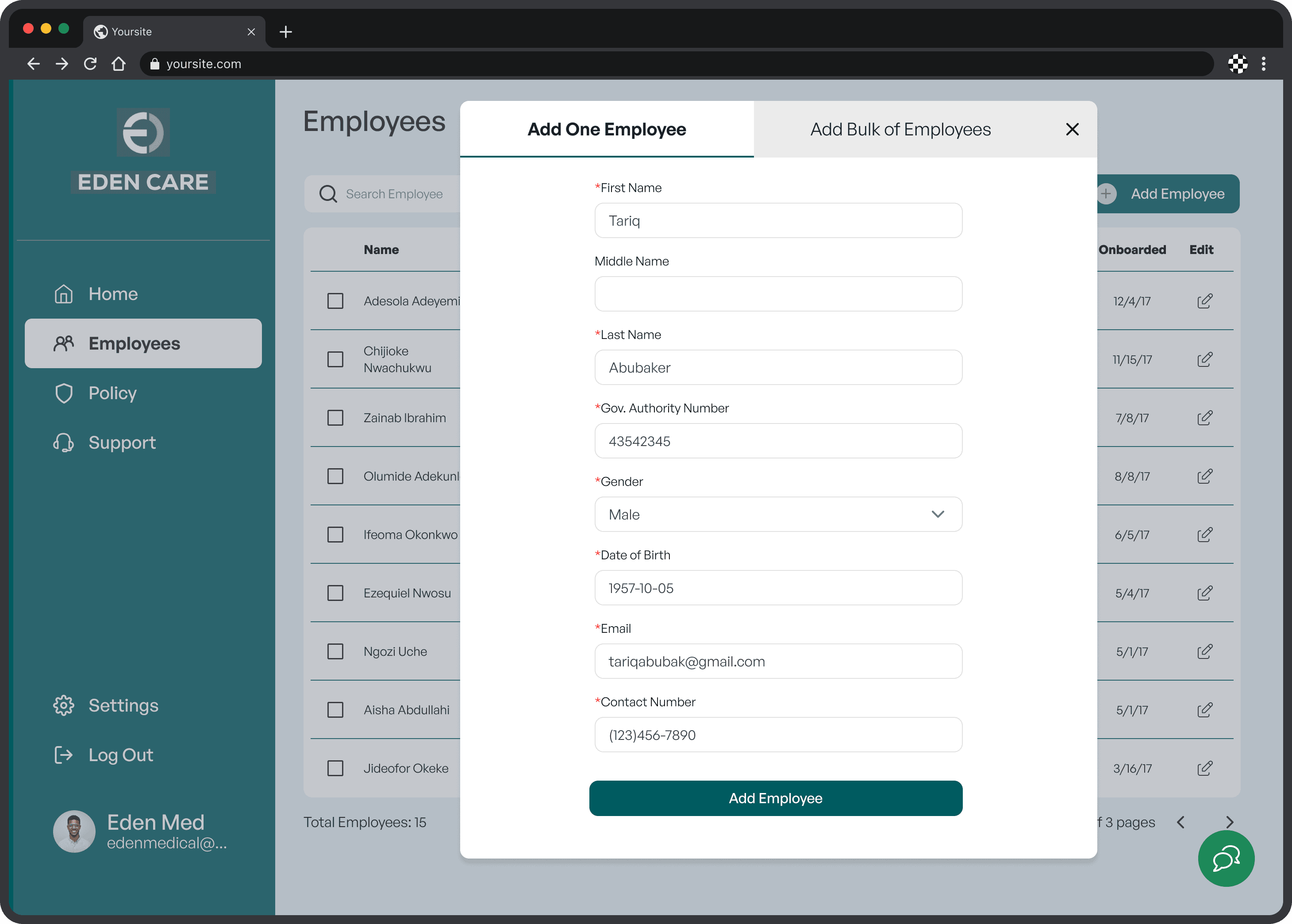
2. Add a new employee.
3. View policy and access support.
4. Manage employee accounts and their notification settings.
Splitting the work up amongst the team, I then followed up with everyone to make sure our respective flows were working as expected.
user testing
Try it on for size
Where can we improve?
Working in order of priority, we sought to solve these issues by:
Reassessing the location of certain modalities within tabs on the webpage
Reconsidering the design of confirmations and processes
High-fidelity mockups
Let's make some changes
First consideration
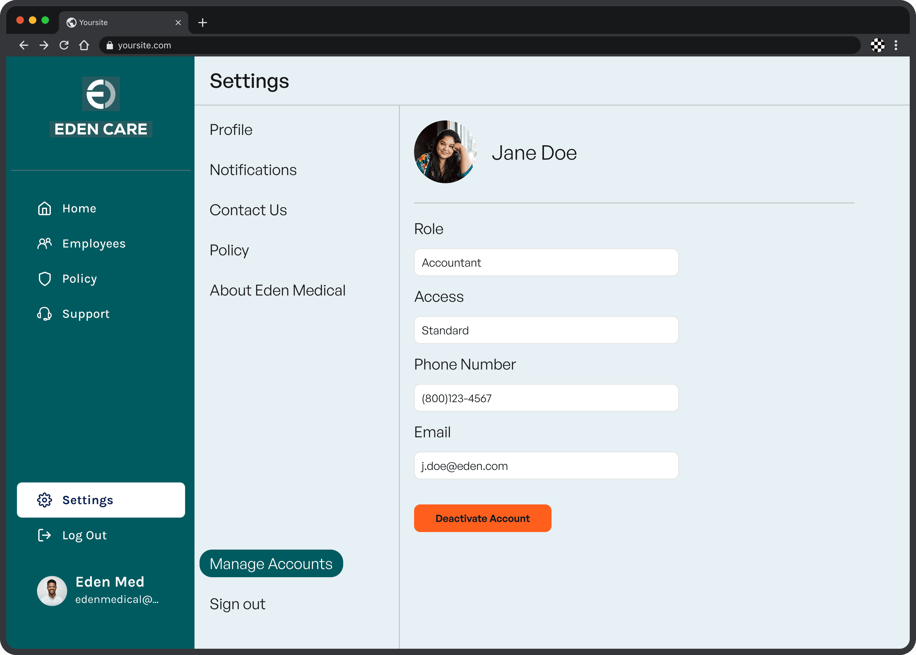
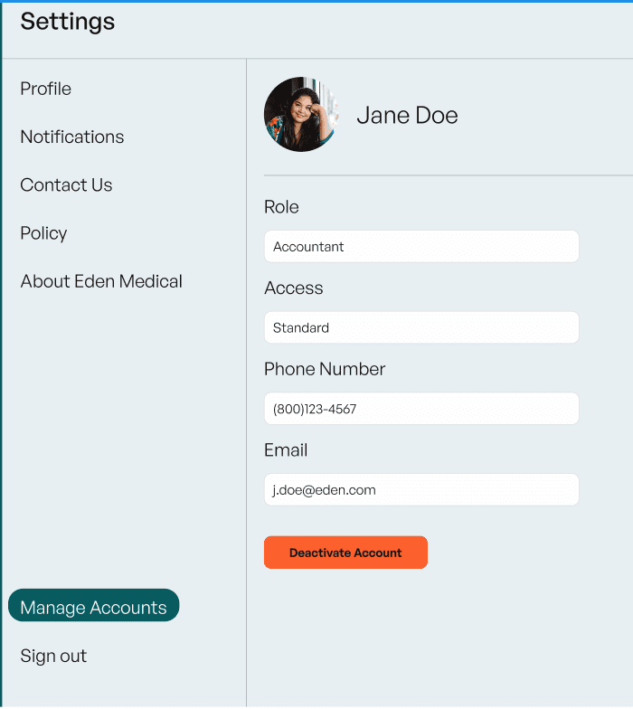
Why open up one’s own settings in order to manage another employee’s?
The current IA of the portal was set up in this way. Because users are accustomed to seeing only their information within a “settings” tab, it made sense that there was confusion regarding this user flow.
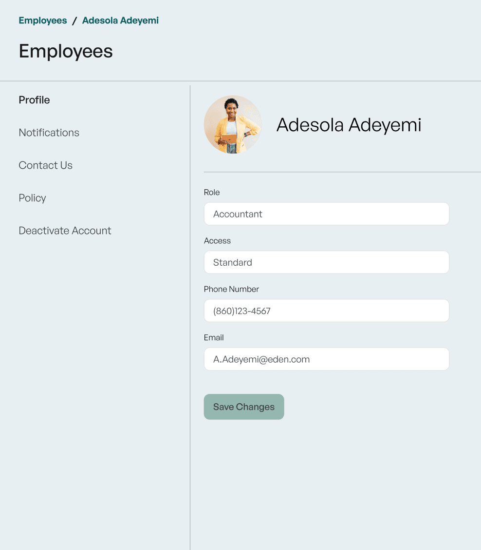
To solve this issue, we rearranged the IA of the portal to provide the user access to employee accounts & their information via the “Employees” tab.
second consideration
Why was the only access point to support given on the “policy” tab of the portal?
Furthermore, what is the point of the “support” tab?
Many of the users were confused, both by the placement of the support button and its particular design.
The purpose was to open up a chat box, however, the current CTA design seemed more consistent with those meant to open a “support inquiry” email submission.
Before

After
Design Improvements
Regarding the CTA design:
Change the CTA from a classic text button to a FAB (floating access button) with an icon in the right-hand corner of a user’s portal
Make the FAB accessible from every tab within the employee portal
I brought forth the idea to tabulate the window and led its design, including:
Tab for the user to access FAQ support links
Another tab for them to access a “live chat” with a bot/representative
Regarding the purpose of the “Support” tab:
Make the main purpose to access helpful resources and/or submit a support inquiry email
We further iterated upon the design of the support tab, making it consistent with all of the other tabs within the portal
As well, we redesigned the support articles feature in the fashion of accordions to give the user quick preview access
Third consideration
How does a user know for certain that changes have been made?
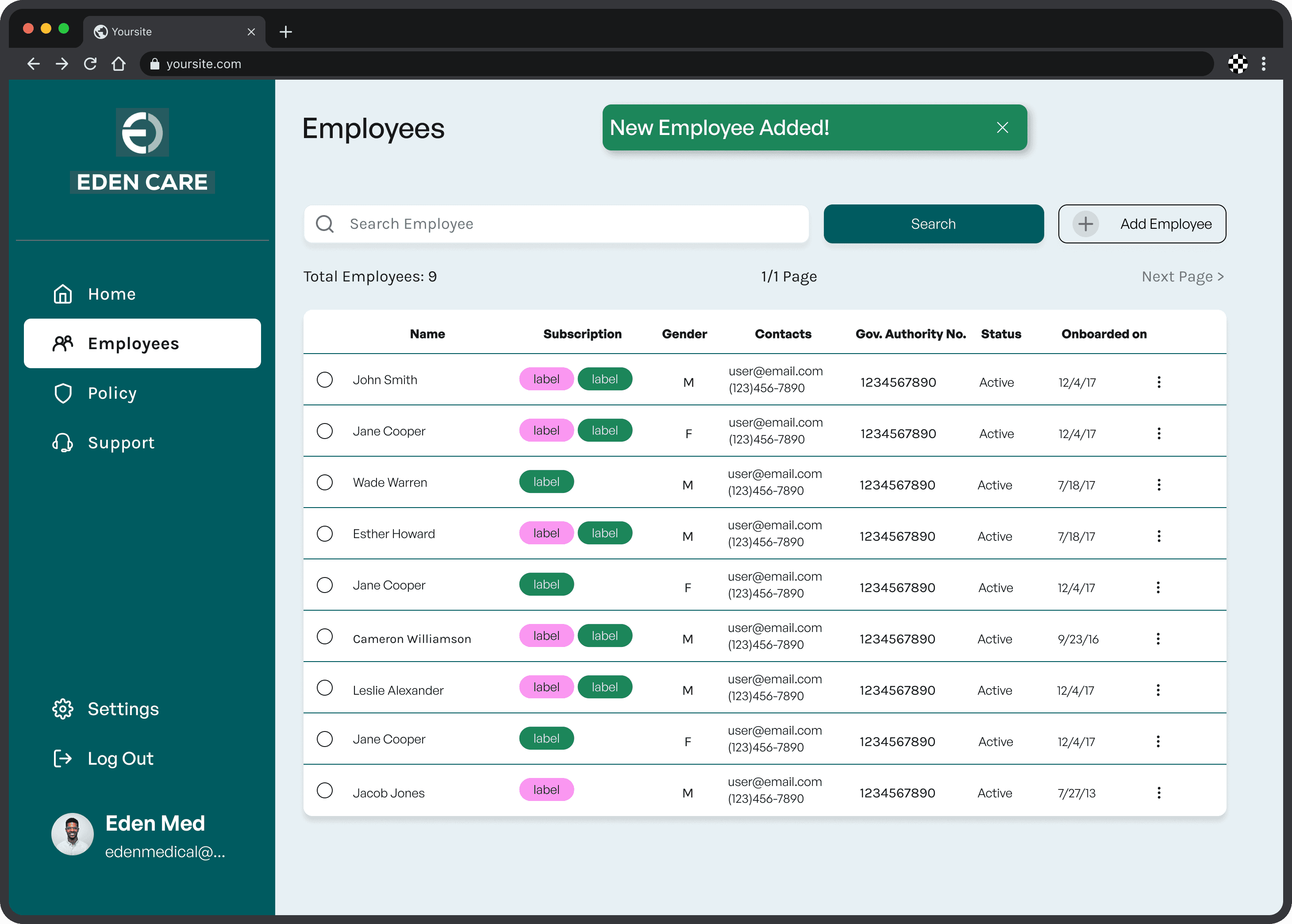
Another pain point was concerning confirmation modals when changing settings/adding employees/changing employee settings/etc.
Design Improvements
We reconsidered the design and placement of the confirmation modals, seeking to make it “pop” so that the user would be made certain of their changes.
Regarding the addition of employees, we added a light fill that differentiates the newly added employee from the others within the table.
Other considerations
Wait, why is this here? What does this say? WHY this color?
Some of the issues not noted during testing, but discovered by the team were regarding accessibility, hierarchy, overall layout, and the portal's information architecture.
Design Improvements
Any spacing/padding issues across the board were resolved to maintain consistency with an 8-point grid
Some colors in the design system were changed to provide contrast that would pass WCAG standards
Issues with the table alignments were redesigned to fix & longer fields like email were set to truncate
Chips/pills were redesigned in a manner consistent with Google's Material Design specs
Breadcrumbs were added to nested pages to give the user a more clear trail as to where they are in the portal
Before
After


summary
The grand reveal
With the existing high-fidelity designs, our team was able to:
Prototype the basic flows & conduct user testing
Develop a report based on our findings & improve upon the designs based on our findings
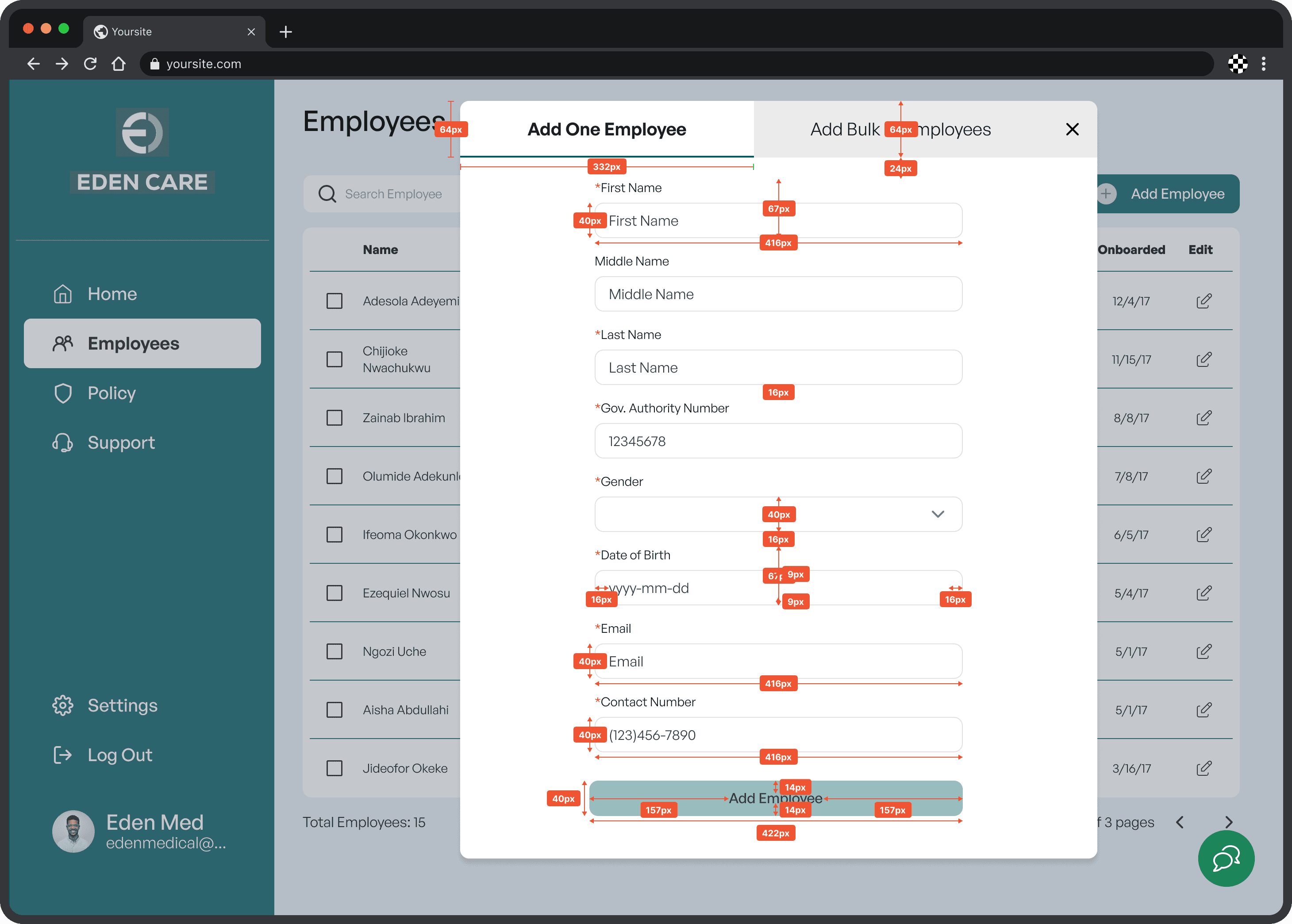
Provide a developer handoff, with all of the necessary information for a smooth transition from design to development
With an organized Figma page, we split the dev handoff up after communicating expectations, making sure to utilize the same plugins for measurements, annotations & flows
The changes our team made will serve to:
Improve consistency and accessibility concerning information architecture, visual hierarchy, and contrast
Provide users with designs that meet their standard expectations, especially in regards to editing settings/information, accessing support, and associated confirmations
dev handoff screens
reflection
Now for a bit of reflection
general
Overall, I quite enjoyed working on this project. I had the opportunity to grow as a designer/researcher and a leader. Our team was very collaborative throughout the whole project, giving and receiving feedback continuously. Not only did this nurture a positive team dynamic, but I believe it also helped us to accomplish the result - an improved product that will hopefully serve Eden Medical's organization and its end-users well.
Challenges
The challenges faced in this particular project revolved less around the overall design, and more so the interpersonal.
As team lead, it was my duty to help foster teamwork and clarity of responsibilities.
One challenge that helped hone my leadership skills was the need to delegate tasks due to time constraints and deal positively with any issues that arose.
Another challenge was in regard to the client:
At times, our client didn't have the opportunity to give their feedback, so our team sought to make the best-informed decisions we could.
Regarding design:
I led the charge on several initiatives and designs, supporting my teammates through feedback and offering help with our design tool - Figma.
This helped me to hone my skills working as a supportive teammate and sharing perspective behind design decisions.
lessons
Communication amongst the team is vital. Responsibilities need to be clear and it is important that teammembers feel that they can share when they need support.
Clients/stakeholders may not be able to give real time feedback, therefore, as a designer this is opportunity to make informed decisions and work to create a useful/accessible product.
This also highlights the need to ask for support from more senior designers when questions arise.
Consistency and accessibility is key. Especially if/when a product has layers of complexity to it - as a designer, we need to critically consider the small details and determine whether or not we are helping to solve user’s issues or creating further ones with our designs.

Next Steps
What's next for Eden Care?
If unconstrained by time the next steps I would have taken are as follows:
Prototype and test new designs with the same user flows to determine the efficacy of changes made & seek to understand any further issues
Continue building out the Employee portal with attention given to designing more unique & specific flows necessary for the success of their product with intended users & their organizational needs.


